In-App Purchases vs Ads: Which Strategy is Best?
You’ve created your app, and people are starting to download,...
Make email marketing simplified
Make email marketing simplified
Make email marketing simplified
Make email marketing simplified
Make email marketing simplified
Make email marketing simplified
Make email marketing simplified
Make email marketing simplified
Make email marketing simplified
Make email marketing simplified
Make email marketing simplified
Make email marketing simplified
Make email marketing simplified
Make email marketing simplified
Make email marketing simplified
We use cookies for our website to give you the most relevant experience by remembering your preferences. By clicking “accept”, you consent to use of ALL the cookies
This website uses cookies to improve your experience while you navigate through the website. Out of these, the cookies that are categorized as necessary are stored on your browser as they are essential for the working of basic functionalities of the website. We also use third-party cookies that help us analyze and understand how you use this website. These cookies will be stored in your browser only with your consent. You also have the option to opt-out of these cookies. But opting out of some of these cookies may affect your browsing experience.
Necessary cookies are absolutely essential for the website to function properly. These cookies ensure basic functionalities and security features of the website, anonymously.
| Cookie | Duration | Description |
|---|---|---|
| cookielawinfo-checkbox-functional | 11 months | This cookie is set by GDPR Cookie Consent plugin. The cookie is used to store the user consent for the cookies in the category “Analytics”. |
| cookielawinfo-checkbox-functional | 11 months | The cookie is set by GDPR cookie consent to record the user consent for the cookies in the category “Functional”. |
| cookielawinfo-checkbox-necessary | 11 months | This cookie is set by GDPR Cookie Consent plugin. The cookies is used to store the user consent for the cookies in the category “Necessary”. |
| cookielawinfo-checkbox-others | 11 months | This cookie is set by GDPR Cookie Consent plugin. The cookie is used to store the user consent for the cookies in the category “Other. |
| cookielawinfo-checkbox-performance | 11 months | This cookie is set by GDPR Cookie Consent plugin. The cookie is used to store the user consent for the cookies in the category “Performance”. |
| viewed_cookie_policy | 11 months | The cookie is set by the GDPR Cookie Consent plugin and is used to store whether or not user has consented to the use of cookies. It does not store any personal data. |
Functional cookies help to perform certain functionalities like sharing the content of the website on social media platforms, collect feedbacks, and other third-party features.
Performance cookies are used to understand and analyze the key performance indexes of the website which helps in delivering a better user experience for the visitors.
Analytical cookies are used to understand how visitors interact with the website. These cookies help provide information on metrics the number of visitors, bounce rate, traffic source, etc.
Advertisement cookies are used to provide visitors with relevant ads and marketing campaigns. These cookies track visitors across websites and collect information to provide customized ads.
Other uncategorized cookies are those that are being analyzed and have not been classified into a category as yet.
Cyberia Tech, Inc. respects your privacy. This Privacy Policy explains how we collect, use, and share your information. By using our services, you agree to this policy. If any other agreements conflict with this Privacy Policy, the terms of those agreements prevail.
Cyberia Tech complies with the EU-US and Swiss-US Privacy Shield Frameworks for handling personal data from the EEA, UK, and Switzerland. In case of any conflict, the Privacy Shield Principles prevail. Learn more at Privacy Shield. Key Definitions
Information linked to an individual, transferred from the EEA, UK, or Switzerland to the U.S.
Data revealing race, religion, health, sexual orientation, and similar categories.
Effective Date: [ 2025 / 08 / 30 ]
Welcome to The Cyberia Tech ! By accessing or using our website or services, you agree to
comply with and be bound by these Terms of Use and our Privacy Policy. If you do not agree with
these terms, please do not use our Services.
Loading
0 %Your First Piece of the Puzzle in
Business Growth
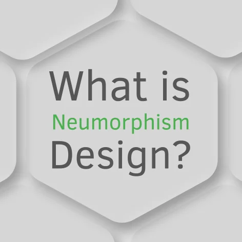

This article is going to explain “What is Neumorphism design”. Neumorphic design became popular a few years ago because it introduced a unique look that was appealing to users.
But the hype subsided after a while. Here we’ll discuss where it came from, how it got attention, and why some designers decided not to create an entire project with it.
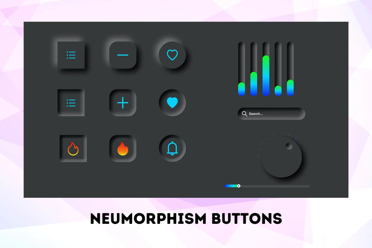
Neumorphism is a UI design style that brings 3D-like aspects to the buttons and other elements in an application. It combines minimalism and real-world shapes to bring a light and soft look to design elements.
In answering ‘What is neumorphism design?’ we find ourselves immersed in a design world where digital elements gently rise and sink in their background, much like ripples on a calm lake, creating a dance of light and shadow that brings a peaceful, feather-soft visual appeal.”
Using pastel colours (low contrast) is another characteristic of neumorphism in UI design. These elements usually have the same colour as the background surface. But it’s not odd to see objects with a slightly different colour in the background.
You may be wondering where this design approach came from. It goes back to another style that is called Skeuomorphism. Keep reading to find out.
It’s a form of UI design that refers to creating interfaces or elements that mimic real-world objects. It was a popular style during the first days of personal computers, as it made it simpler for users to interact with the revolutionary device (the personal computer).
Skeuomorphism is where physical objects go into the digital world. We can see this design approach in the first versions of iOS below.
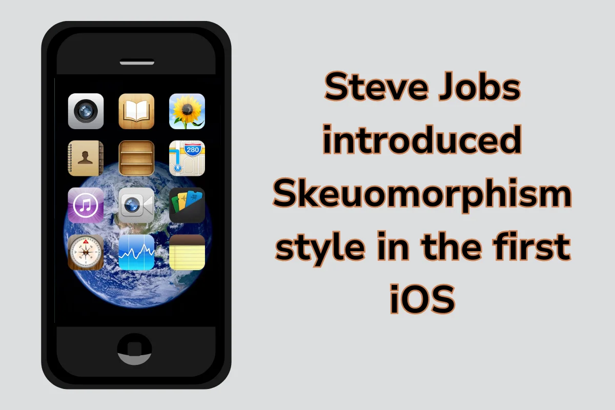
As you can see, the icons resemble objects that we see in our everyday lives. This style made it easier for people to work with various applications.
The Recycle Bin icon on Windows is another example of Skeuomorphism.
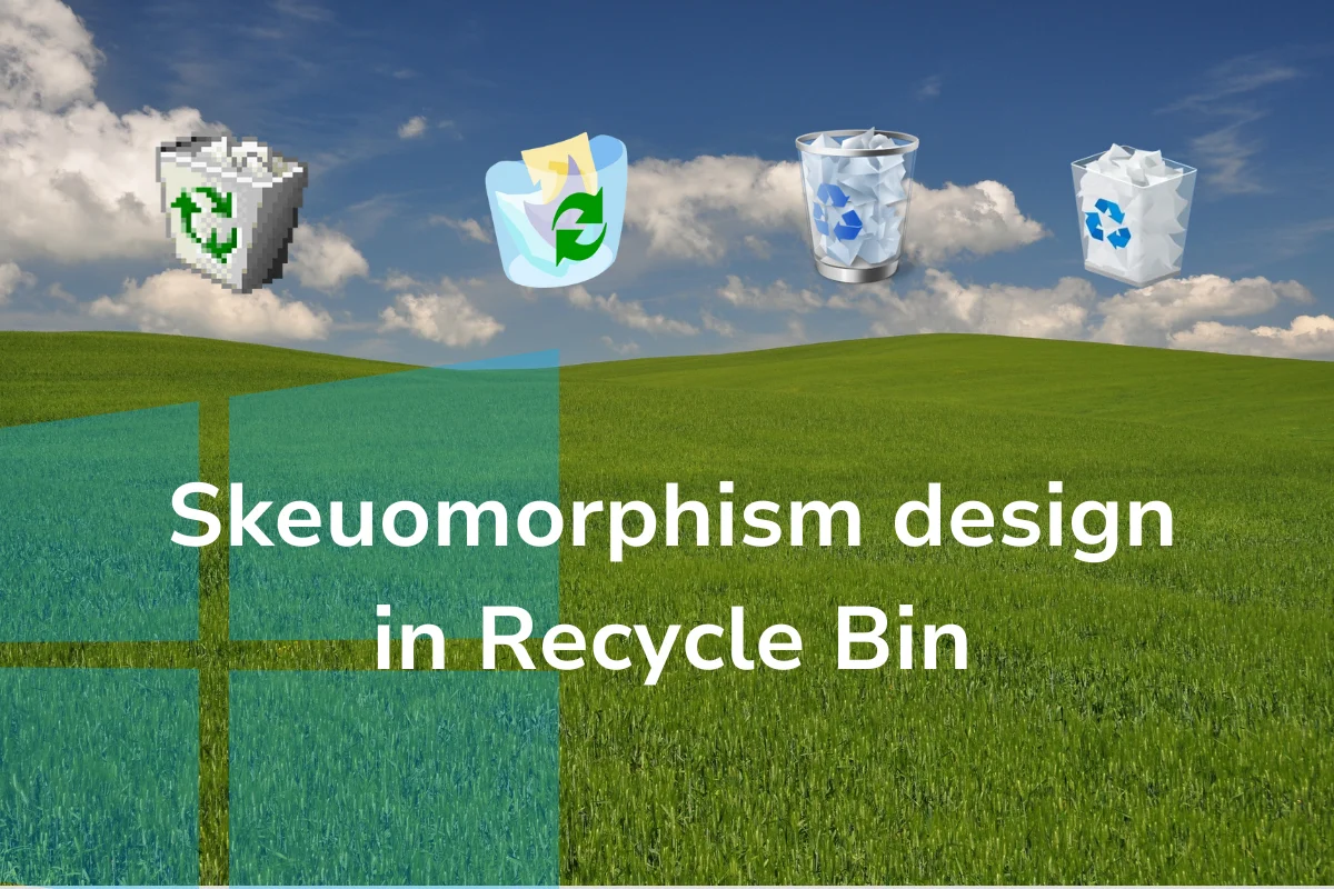
Seeing this icon, we know that we can discard unwanted files or items into it as we do in our daily lives.
Then smartphones dominated the world in the 2010s, and we became digital citizens. There was no need to purposefully highlight the UI elements to guide the user. Therefore, another approach came to light.
Moving away from gradients, textures, and shadows, flat design is a UI style that uses 2D elements with solid colours to focus on the user experience. It consists of minimal fonts and layouts with white space to prioritise functionality over elegance.
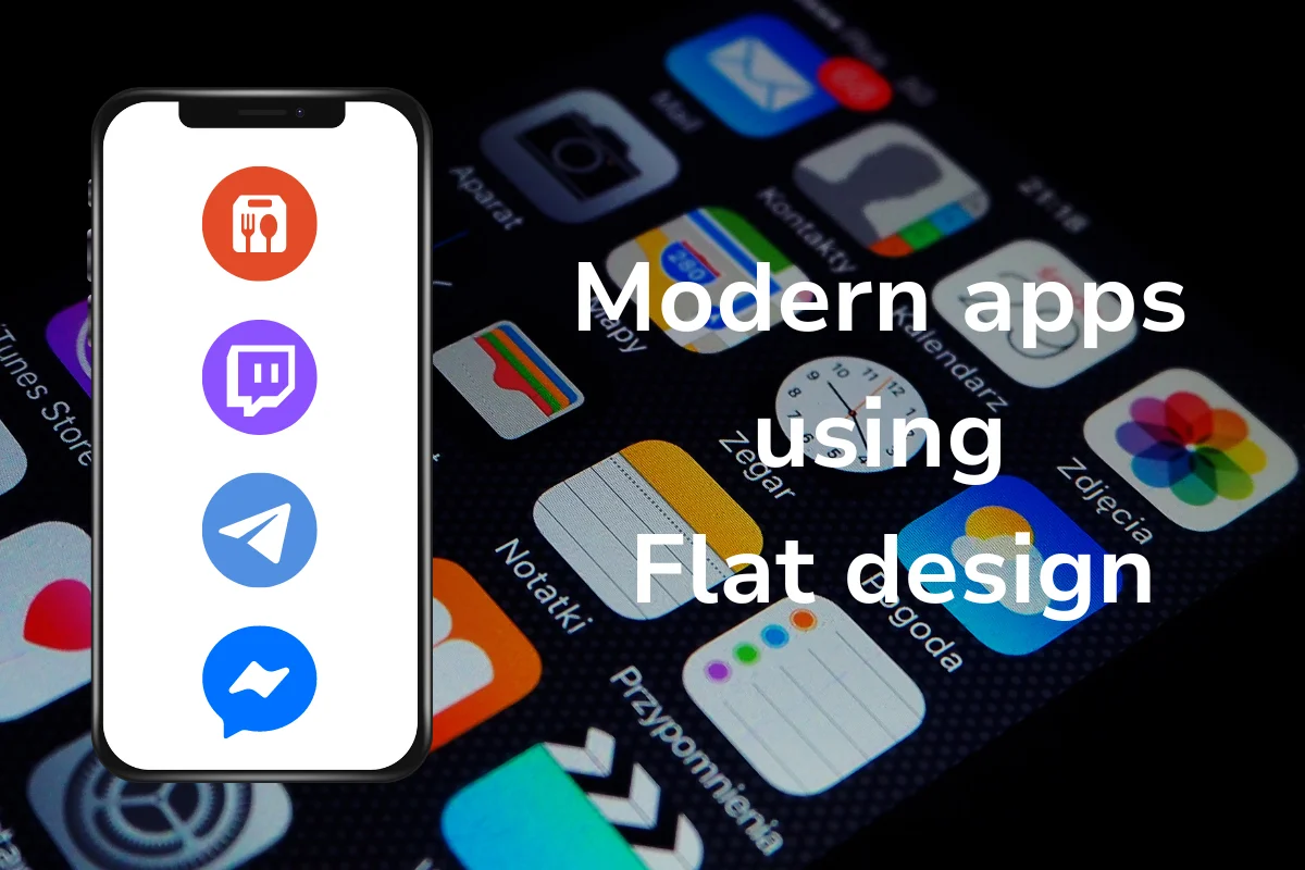
Flat design is considered too minimal by some designers, though it’s being used in many contemporary projects.
In 2019, a designer named Alexander Plyuto published photos of an interface that is a blend of Skeuomorphism and flat design. This new-born style was called “Neumorphism”. As you can see in the image, the design is a mix of simple design and floating, physical-like components.
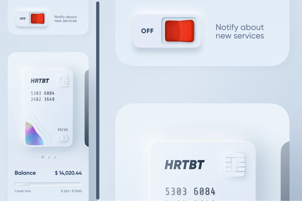
Neumorphism design is also called “soft UI.” The buttons seem to be raised in the background. Pale colours and shadows are visible to give it a natural feel.
Alexander’s design went viral, and many others started to depict their own creations. The hype went up as Apple introduced macOS Big Sur in 2020. The tech titan brought icons with light shadows and soft edges.
As neumorphic design flourished, many experts started to criticise this new method. The designers disapproved of Neumorphism because they thought it wouldn’t make a major change in terms of usability. They pointed out that it’s just a contrast to the traditional design.
Well, it’s not completely disregarded in the UI design world. Because of its limitations (more about it in the following), it’s not the prevailing option to create a user interface.
If you’re asking why Neumorphism went far from being a mainstream approach, keep reading.
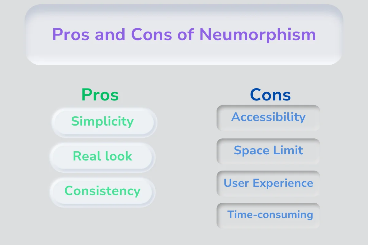
This design method is a minimalist style that can sooth the users from the overwhelming user interfaces we see every day. While it may be pleasant for some users, it can be counterintuitive for others. Below you’ll find out about the pros and cons of this approach.
Here you can read about the advantages of neumorphism:
Below, we mention some disadvantages with the neumorphic design:
In the image below, we have summarised the pros and cons of using neumorphism design in web and mobile applications.
You may wonder which design style will be trendy in 2024. To give you a picture, we can mention some of them:
What is the difference between flat and neumorphism?
For example, neumorphic design uses 3D elements to show whether a button is pressed or not. Flat design does this by changing the colour of the button.
As said in the article, Alexander Plyuto uploaded some designs on the internet that drew the attention of others. Another designer named Jason Kelly mixed “neo” and “Skeuomorphism” to create the term “neomorphism.”
What are the principles of Neumorphism?
This style consists of using pastel colours, usually in the same spectrum as the background. Designers use shadows and highlights to give a real-life look to the buttons and forms.
In this article, we tried to answer “What is Neumorphism design”. This style became popular in 2019, but due to some accessibility issues that we mentioned in the article, it lost its hype. However, we believe neumorphism is still a work in progress.
Neumorphic design can be an opportunity to redesign common elements and present a new experience to users. It’s a good choice for small designs and can be used for images and graphics that are not functional.
Experts are trying to improve it to fit the users’s needs. So, it can stay on track in the future as it’s a simple and realistic approach.
You Can Get More Information!